Monday, 13 June 2016

John, Elsie and May

My great-grandfather and two of his daughters


I haven't been feeling very creative lately. This layout was started back in February and a large chunk of it was already planned out otherwise I wouldn't have had the creative energy to complete it.  Just needed to add a few details to finish it off but those ideas were frustratingly slow in coming.

I used Blue Fern Studios paper from their Timeless collection.


Blue Fern Studios - Timeless - Calling Cards
(I used the backside for the background of the layout)
Blue Fern Studios - Timeless - Song
(I used the backside for the 2 rectangular die-cuts)


These are the dies and punch I used:


Spellbinders
- Romantic Rose
Lifestyle Crafts
- Nesting Doily Rectangles
Cheery Lynn Designs
- Japanese Garden Lace Oval
My Favorite Things
- Mini Delicate Doilies

EK Success - Round Binding Edge


As I usually do, I layered each die-cut over a darker version and offset them slightly to accentuate the edges.

I used pieces of plain chipboard and foam tape under the photo and rectangular die-cuts to add dimension to the layers.


These are the chipboard pieces I used:

Dusty Attic- Leafy Scroll
Dusty Attic - Botanic Accents #2


I painted the Leafy Scroll piece a peach colour and applied Ranger Crackle Accents.  I rubbed the dried crackle with dark brown ink to accentuate the cracks (wiping off the excess) and then lightly dabbed some pale yellow and cream coloured paint over top with my finger to dull the glossy finish and grunge it up a bit.


The Botanic Accents piece was painted dark brown, inked with clear ink and embossed with Dried Marigold Distress embossing powder.  I then inked the edges in brown using a craft nib and dabbed some cream paint on top with my finger.


Around the edges of the paper I randomly applied some brown floral washi tape (one piece was actually used to cover some sloppy punching while the others were added to balance it out and pretend that it was all on purpose).

Along the border of the layout I did some machine embroidery stitching with dark brown thread and some hand stitching with an ecru coloured yarn.  I used the We R Memory Keepers Sew Easy tool to punch the hand-stitched pattern in the paper (the holes never seem to punch all the way through so I go over them with a piercing tool before stitching).

We R Memory Keepers - Sew Easy tool


I also applied some "fuzzy navel" Prills among the floral clusters and at two of the photo corners.


Thank you so much for taking a look!


Friday, 6 May 2016

By a Tree in the Woods

Colin on Oct. 5, 2014


For this layout, I did some more experimenting with Brusho Crystal Colour on Ranger Specialty Stamping paper using a resist technique.  Using clear ink, I stamped the background and then heat-embossed the stamped pattern with clear embossing powder.  I then sprinkled Moss Green Brusho Crystal Colour on the paper and misted with water.


Impression Obsession stamp - Dotted Floral


This is what the background looked like after sprinkling with the Moss Green crystals but before misting with water.  I darkened the photo shown here so the clear stamped pattern would be more visible.


And this is after I misted it with water:


After that, I punched and inked around the edges of the paper and did some stamping with brown ink.


Martha Stewart punch - Flourish Lace
Tim Holtz stamps - Bitty Grunge
(I used the stamp on the lower left)


I also used the Moss Green powder to colour some of the embellishments.  I used a little bit of the powder heavily diluted with water to colour the large white Gardenia flowers using a paintbrush.  The large roses were misted with water then sprinkled with the powder.  I then applied some more colour to the edges of the rose petals with a brush using the powder mixed with only a tiny bit of water.


The chipboard pieces were painted white and then brushed with a heavily concentrated solution of the Moss Green powder and water.

Dusty Attic - Moroccan Border
Dusty Attic - Branches and Berries


I also tucked little pieces of reindeer moss into the flower clusters and glued random patches of Prima Art Stones around the layout.


Thank you so much for taking a look!


Thursday, 28 April 2016

Colourful Colin #1

My son, Colin, on October 18, 2011


Though he is very shy and hesitant in most situations, my son, Colin, likes to "ham it up" when I take pictures. The photo I used for this page was one of a series I took of him when he was 8 years old.   Originally I had planned to make a multi-photo layout and call it "Colourful Colin" but I could never figure out what to do.  This particular photo seemed to fit with the colour of this background paper so I finally decided to abandon my multi-photo page and just use one.  I may never get around to creating "Colourful Colin" layouts #2 through #5 but the photos are already printed so I'll leave that option open.


Recently I noticed this product called Brusho Crystal Colour in various online craft and scrapbooking stores.  After investigating, I decided it looked kind of interesting (despite the boring white jars it came in) so I bought some to experiment with.  Brusho Crystal Colour is basically what the name implies, colour crystals.  I poked a hole in the top of the jars (like I saw in some videos online) and sprinkled the crystals on white paper, then misted with water.  I tried various papers but didn't really like the way it looked until I tried it on Ranger Specialty Stamping paper.  The crystals really blend and swirl beautifully together on this coated paper.  On regular scrapbooking papers, watercolour paper and even papers I pre-coated with matte medium or clear gesso, the colours sink in and spread too much and look rather boring and muddy.


This is what the background page looked like after sprinkling with the Brusho Crystal Colour and misting with water.  I also went back and sprinkled more colour into the wet areas.


Dark Brown Brusho Crystal Colour on Ranger Specialty Stamping Paper


For this page I only used the colour "Dark Brown".  Each "colour" is actually a mixture of different coloured crystals (some have more of an eclectic variety, some are more monochromatic).


I added some stencilling with modelling paste in the corners and near the edges later.  The wet modelling paste reactivated some of the crystals and that is why the there are more reddish splatters in those areas.  I also did some random punching (with MS punch, Gothic Lace) around the edges and added some little adhesive tiles along those areas.


The chipboard lattice was painted brown, then coated with Distress Crackle Paint in Tattered Rose.  I then inked the edges in brown.

Blue Fern Studios - Garden Lattice Bits


The chipboard leaves were coated with clear ink and heat embossed with UTEE (ultra thick embossing enamel).  I then inked them with some red and brown chalk inks and dabbed them lightly with a peach coloured paint.
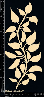
Dusty Attic - Leafy Stem #3


The corrugated cardboard was painted white and coloured lightly with some of the Dark Brown Brusho Crystal Colour mixed with water and applied with a brush.  I also inked the edges in brown and layered the cardboard over some dark brown burlap which I also used to mat the photo.


Here are some more close-ups:


Thank you so much for taking a look!