Monday 26 June 2017

Glenn and Lori

My brother and sister in 1962


For this layout I used some old Fancy Pants Designs papers from their Lilac House collection.


I did some stencilling on the upper left and lower right corners with molding paste.  While the paste was still wet I heat-embossed it with Verdigris Antiquities embossing powder.


These are the dies and punch I used:


Spellbinders
Timeless Rectangles
EK Success
Argyle punch


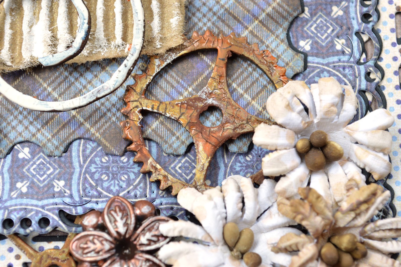
The two small flourish chipboard pieces were from a store that is no longer in business.  I did a white crackle finish (Picket Fence Distress Crackle paint) and then inked them with Gathered Twigs and Evergreen Bough Distress Inks, wiping off the excess.


The other chipboard piece is by Blue Fern Studios.

Blue Fern Studios
Daisies Collage


I painted the Daisies collage grey and sponged some white paint overtop the bricks to give it a mottled effect.  I then painted the flowers in various shades of turquoise, painted the stems green and did a wash of white overtop.  I finished by gluing Express-O Yourself Prills in the center of each flower using Artquest Perfect Paper Adhesive (matte).


The medallion was made with Sculpey Ultra Light and a mold and then painted.
Prima Iron Orchid Designs
Medallions


I painted it with Prima's Patina Effect Pastes and wiped Vintage Silk Opal Magic wax over the raised areas with my fingertip to highlight them.  I glued a decorative brad in the center to add some interest.


Thank you so much for taking a look!


Friday 23 June 2017

Dish Duty

My grandfather (left) in the British Army during the First World War


For this layout, I used Authentique paper from their Rugged collection.


Rugged Five
Rugged Eight
Rugged Seven
Rugged 6x6 Bundle


These are the dies I used:


Tim Holtz Sizzix
Postage Stamp Frame
Cheery Lynn Designs
Deutschland Boutique 
Cheery Lynn Designs
Horizon Rectangle


These are the chipboard pieces I used:


2Crafty
Ada's Flourishes
ScrapFx
Cogs-Mini
Dusty Attic
Cogs1


I painted the cogs dark brown and applied Antique Bronze Distress Crackle Paint.  I then rubbed them with Sandalwood and Rust Gilders Paste Wax and very lightly rubbed some white paint overtop to highlight some of the texture.  


I also did the antique bronze crackle finish on Ada's Flourishes but didn't like how the colour blended too much into the background so I wiped blue and white paint overtop with my fingertip.


For the mat under the photo I took a piece of corrugated paper and brushed white paint over the raised ridges and then sprayed it with Walnut Gold Glimmer Mist.


I rubbed Sandalwood Gilders Paste Wax on the metallic border pieces along the top and bottom of the layout.


Here are a couple more close-ups:


Thank you so much for taking a look!


Friday 16 June 2017

Climbing

My son, Colin, in 2007


For this layout, I used Maja Design paper from their Enjoying Outdoors collection


Maja Design
Enjoying Outdoors - Tags & Journaling Cards (bs)
Maja Design
Enjoying Outdoors - Autumn Hues
Maja Design
Enjoying Outdoors - Singing in the Rain (bs)
Maja Design
Enjoying Outdoors - Gardening (bs)


I did some stencilling on the background with Faber-Castell whipped spackle.


The Crafter's Workshop
Tile Mania (6x6)


These are the dies I used:


Spellbinders
Romantic Rectangles Two
Spellbinders
Grand Decorative Circles


These are the chipboard pieces I used:


Dusty Attic
Geometric Border

Blue Fern Studios
Charleston Corners
Blue Fern Studios
Organic Vine


For the Geometric Border and Charleston Corner, I tried various things inlcuding embossing them with Distress Embossing Powder but didn't like the way they looked so I painted over them with white paint.  I then rubbed Seedless Preserves and Dusty Concord Distress Inks on them and misted them with water.  After that was dry I traced around the edges with a black marker to make them stand out more.


The Organic Vine was painted green and Ranger Crackle Accents was applied.  I then rubbed brown ink over them to accentuate the cracks and wiped the excess off.  I also rubbed a little white and purple paint on them with my fingertip and added a touch of black ink around some of the edges.


The flowers are by Petaloo and Prima and the berries are by Blue Fern Studios.


Thank you so much for taking a look!


Sunday 11 June 2017

Helga and Her Boys

My paternal grandmother and her four sons (my father is standing at the back on the right)


For this layout I used papers from Prima's Salvage District collections.


I ripped some corrugated paper, inked the edges, sprayed it lightly with some Walnut Gold Glimmer Mist and tucked it underneath the ripped edge of the paper to add some texture.


These are the dies I used:


Spellbinders
Floral Assortment
Tattered Lace
Ornate Leaves


The clay piece under the photo was made with Sculpey Ultra Light and a mold.  I sealed it twith matte medium, brushed it with Prima's Parthenay and Antoinette Pink Artisan Powders and sprayed it with Lindy's Stamp Gang Whale Watch Blue.


Prima Iron Orchid Designs
Baroque 4


The chipboard pieces on the upper left and lower right corners were painted brown.  I applied Picket Fence Distress Crackle Paint, let it dry and brushed them with the Parthenay Artisan Powder, wiping off the excess.


Dusty Attic
Art Deco Frame Set


Most of the flowers are from Prima's Salvage District collection.


Thank you so much for taking a look!