Wednesday 14 September 2016

Great-Grandfather George

My Great-Grandfather George


For this layout I used Blue Fern Studios papers for the background and Maja Design papers for most of the die-cuts.


BFS Tranquility - Serenity
(I used the backside)
BFS Serendipity - Fascination
(I used the backside)


Maja Design Enjoying Outdoors
- The Great Nature bs
Maja Design Coffee in the Arbour
- Smell of Coffee bs
Maja Design Enjoying Outdoors
- Spending Time


I stamped the corners of the Serenity paper with a couple of clock stamps using black Archival ink.


LaBlanche - Clock Background
LaBlanche - Intricate Watch


I ripped the corners and distressed the edges of the Fascination paper and stained them using various colours of liquid brown ink from re-inker bottles using a paintbrush.


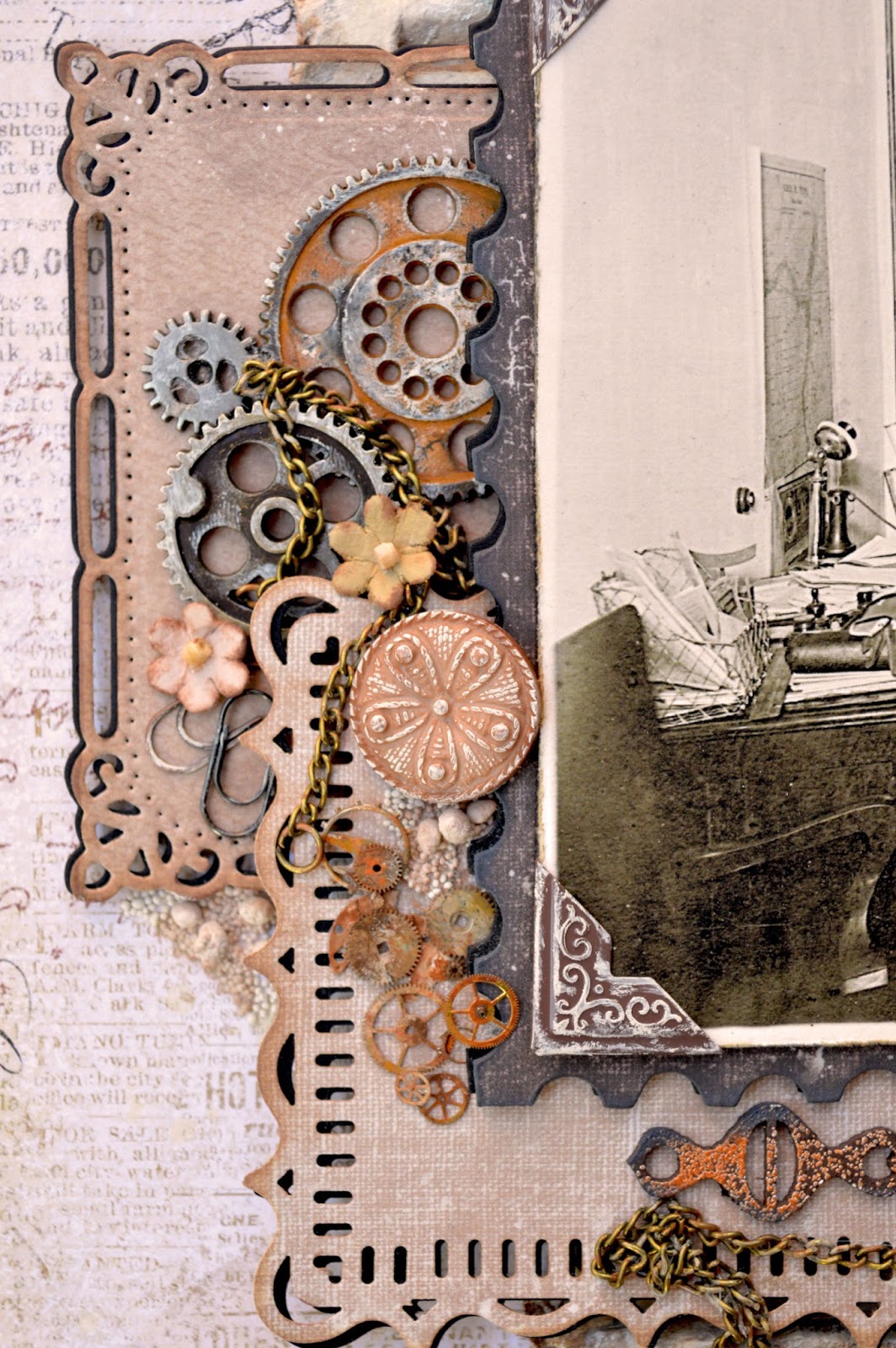
As usual I layered most of the die-cuts over a darker verison, offsetting them slightly to accentuate the edges.  These are the dies and punch I used:


Tim Holtz - Postage Stamp Frame
Spellbinders - Marvelous Squares
Martha Stewart punch - Flourish Lace


Cheery Lynn Designs - Queen Anne's Lace Border


These are the chipboard pieces I used:


Blue Fern Studios - Mixed Chains
Blue Fern Studios - Notebook Edges


The Mixed Chains piece was painted dark brown, inked with clear ink and sprinkled very lightly using BFS Nutmeg embossing powder and then heat set.  I then inked the edges lightly in black.


The small piece of the Notebook Edges was painted with antique white craft paint and inked lightly overtop and around the edges with light and dark brown inks to grunge it up a bit.


The pieces of corrugated cardboard were painted antique white and brushed with a silvery mist randomly overtop.  I then brushed them with very watery brown paint and inked around the edges with brown ink.


I also added some random patches of Prima Art Stones.  I applied heavy matte gel and sprinkled the Art Stones on top, then tipped off the excess after the gel was dry.  I also applied some brown mist overtop.


I used my finger dipped in the antique white paint (dabbing most of it off on my craft mat) and rubbed it over a lot of the embellishments to highlight details and grunge them up.


I used Beacon's 3-in-1 glue to adhere most of the embellishments and layers.  It can be rather messy and stringy but with careful application it is well worth it.   It has a really good grip once it is dry which is needed for the heavier metal embellishments. 


Thank you so much for taking a look!


Friday 15 July 2016

Tricycle

My mother, Cecilia, in the early 1940's


For this layout I used a piece of Blue Fern Studios paper as the background.

Blue Fern Studios - Serendipity - Calling Cards


I stamped around the edges of the paper using a border stamp with Ground Espresso Distress Ink and randomly over the page using a couple of texture stamps and Watering Can Archival Ink.  I then distressed the paper edges and inked them with the Ground Espresso Distress Ink


Blue Fern Studios - Shabby Edges
(I used the stamp on the right)
Tim Holtz - Bitty Grunge
(I used the stamp on the lower left)


Tim Holtz - Urban Tapestry
(I used the stamp on the upper right) 


These are the dies I used:

My Favorite Things
- Mini Delicate Doilies
Cheery Lynn Designs
- Polynesian Sails Doily
Cheery Lynn Designs
- Lilith Doily


As usual I layered the die-cuts over a darker version and offset them slightly to accentuate the edges. I also inked the edges with Creamy Brown Colorbox Chalk ink and added some subtle shading around the layout with the Creamy Brown ink as well.


These are the chipboard pieces I used:


Blue Fern Studios - Gatsby Collage
Blue Fern Studios - Jeweled Trinkets


I heat embossed the Gatsby Collage with Weathered White Antiquities Embossing Powder, sprayed it with some pink mists (the mists tend to just sit and float on the embossed surface and don't sink in so it only gives a very subtle colour). I also applied brown ink along the edges using a craft nib.  


The Jeweled Trinket was painted black, coated with Picket Fence Distress Crackle paint and rubbed and edged with pink and brown inks.


I glued patches of Prima Art Stones around the layout and applied a light wash of watercolour paint overtop to add some shading.


Thank you for taking a look!


Saturday 18 June 2016

England, 1921


My grandmother with her two eldest children and stepmother in 1921, 
shortly before my grandparents moved to Canada


This is another layout I began months ago and got stuck on.  I had started with a different background paper and just recently tried doing some machine stitching on it to add some interest. Well, I hated the way it looked.  Rather than using another sheet of the same paper and going back to what I had been stuck on for months already, I tried finding a different piece that would coordinate with the flowers I had already chosen, hoping to give myself a bit of a fresh start without completely going back to square one.  I liked the way this paper looked and ended up finishing the layout rather quickly after that.


The background paper is from Blue Fern Studios Serendipity collection.


The chipboard frame around the photo is also by Blue Fern Studios.  I applied various colours of paint, ink and embossing powder to it until I finally got something I liked but as I did that months ago I really can't remember exactly what I did (I just remember being frustrated about it a lot, lol).

Blue Fern Studios - Marseille frame


I did some stencilling with molding/modelling paste on the background and used watercolour paints to add some subtle colouring to those areas.


Tim Holtz - Bricked
Prima - Floral Petites


These are the dies I used:

Tattered Lace - Ornate Leaves
Memory Box - Quinn Flourish


In the center of the lace flowers, I glued some Prills (Tu Tu Pink).


I also glued random patches of Prima Art Stones around the edges of the paper and the flower clusters, adding some watercolour paint overtop to give them some subtle colour and shading.


Thank you so much for taking a look!