 |
| My great-aunt, May |
I used an old photo of my great-aunt May, taken sometime in the 1910's. I'm not sure why she was dressed up like an 18th century boy (perhaps for a game of dress-up or a school play). I tinted the scanned photograph to go better with the background papers.
For this layout I used papers from the Blue Fern Studios, Timeless collection and some plain brown Basic Grey papers for some of the die-cuts.
 |
| I used the backside for the background of the layout |
|
 |
| I used the backside for the outer mat of the layout |
|
 |
I used the card on the middle left
behind the window chipboard piece |
|
 |
I used the backside for some of the square die-cuts
and foliage die-cuts |
|
|
 |
I used the backside of this for the dark brown large doily
and mini doily die-cuts and the mat behind the photo |
I carefully ripped the Freedom paper, trimmed and distressed the edges before tinting the exposed white core of the paper with some diluted ink. The pink was a mixture of Milled Lavender and Tattered Rose Distress inks. I then added a hint of brown ink to the edges ( a mixture of Distress inks I can't quite remember because I tried a bunch of stuff before I got a colour I liked). I glued the ripped, distressed pieces to the Abode paper with Beacon's 3-in-1 glue (it's messy but I like using this glue because it has some initial tackiness so things stay in place but I also have some time to slide things around slightly if they aren't quite positioned right).
These are the chipboard pieces I used:
|
 |
Blue Fern Studios -
Lisa's Window |
|
 |
Blue Fern Studios-
Mixed Chains |
|
 |
| Dusty Attic - Elegant Swirl #13 |
For the window I painted it dark brown and then applied Tattered Rose, Distress Crackle paint. I rubbed various colours of brown and grey ink overtop to highlight the cracks more (wiping off the excess). I also used a waterproof brown marker to accentuate the edges. I then cut a piece from the Calling Card paper and glued the window on top. Once this was dry I applied Ranger Glossy Accents into the "window panes" to look like glass. I weighted the edges of the window down while this was drying because the paper and window started to warp.
I tried heat-embossing the swirl pieces with a couple of different powders but didn't like it so I mixed some paint to roughly match the colour of the window and painted over them. Then I dry-brushed white paint overtop so the colour didn't look so flat.
The small chain piece under the window was heat-embossed with Rust, Embossing Antiquities. I also used the brown marker to accentuate the edges and dry-brushed it with a little of the same paint I had mixed for the swirls.
These are the dies I used:
 |
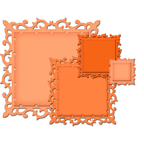
| Spellbinders - Fleur de Lis Squares |
|
 |
| Spellbinders - Floral Assortment |
|
 |
Cheery Lynn -
Canadian Kaleidoscope Doily |
|
 |
Cheery Lynn -
Canadian Kaleidoscope Tiny Doily |
| |
 |
| Tattered Lace - Ferns |
As usual, I glued all the die-cuts over a dark version (in this case, black) offsetting them slightly to accentuate the edges. I inked around all the edges as well. For the brown fern leaves I dipped my finger in the paint I had mixed earlier for the chipboard swirls, tapped off the excess on my craft mat and dragged my finger across the leaves. I also used this paint to highlight the edges of the roses and the details of the metal corner piece at the bottom left of the photo.
At a few random places along the edges of the layout I applied blobs of white glue, sprinkled on some mica flakes, beads, and embossing powder and melted it with my heat gun. I then glued a bit of netting, a few more flakes and embossing powder and very briefly heated it (the netting will melt and dissolve if too much heat is applied). A few small flowers were added at the end.
 |
| Mica Flakes - Henna |
|
 |
| Mica Flakes - Mulberry |
|
Thank you so much for taking a look!


Tracy - your page is so very beautiful! I love your wonderful design and all the elements and flowers are lovely! And, the photo of your Aunt is just wonderful!
ReplyDeleteOh MY GOODNESS! I'm completely in love! This is STUNNING - to say the least. The design, the photo (WOW) and every little detail in between is simply amazing!
ReplyDeleteBeautiful page, love the photo. You tinted it perfectly to match those beautiful papers and embellishments. Love the whole design.
ReplyDeleteOh wow this is exquisite! love all the details, layers and fabulous papers you have used.. love this..
ReplyDeletewow.... gorgeous...the colors, the crackled window frame.... ferns... love it:)
ReplyDeleteI just found your blog! Heritage scrapbooking is my love. Your work is absolutely stunning.
ReplyDeleteMy question about this beautiful page is ... what do you use to tint the scanned photo? That is a technique I am not familiar with, but it is gorgeous with these papers.
Thanks! I probably should have been more specific and said that I "tinted" it using Photoshop. I never want to wreck the original so I scan the photos then experiment with various photo filter options in Photoshop before printing.
Delete